
Motivation
Make the public data more accessible
What is data visualisation?
There is a glossary of terms in this field such as information visualization, infographics, data graphics, quantitative information graphics, statistical graphics, functional art and art science.
Edward mentioned the idea of designed presentation of data.” (1.p51) “Data visualization is the representation and presentation of data to facilitate understanding.”(Andy, handbook p19)
Edward Tufte said that “data graphics visually display measured quantities by means of the combined use of points, lines, a coordinate system, numbers, symbols, words, shading, and color”.(1.introduction) “Data visualization has two different properties, namely marks and attributes. Marks are visible features like dots, lines and areas. Attributes are variations applied to the appearance of marks, such as the size, position, or color.”(Andy Kirk, handbook p21).
Function of data visualisation
A graphic worthy of modern art. (Edward, p91) ;
An instrument to help people reason about quantitative information. (Edward, p91)
Fundamental graphical designs (types)
“Edward divided graph into four fundamental graphical design: data map, time series, space- time narrative, designs, and relational graphics. (1.p15)”
“Narrative graphics of space and time: an especially effective device for enhancing the explanatory power of time-series displays is to add spatial dimensions to the design of the graphic, so that the data are moving over space (in two or three dimensions) as well as over time. Three excellent space-time-story graphics illustrate here how multivariate complexity can be subtly integrated into graphical architecture, integrated so gently and unobtrusively that viewers are hardly aware that they are looking into a world of four or five dimensions.(1.p40)”
Graphical excellence or Principles
Trustworthy or Precision
Telling the truth about the data; Graphics must not quote data out of context. (1.p77)”
The representation of numbers, are physically measured on the surface of the graphic itself, should be directly proportional to the numerical quantities represented.
Clear, detailed, and thorough labeling should be used to defeat graphical distortion and ambiguity. Show data variation, not design variation.
The number of information-carrying (variable) dimensions depicted should not exceed the number of dimensions in the data. “The use of two or three dimensions to show one-dimensional data is a weak and inefficient technique, capable of handling only very small data sets, often with error in design and ambiguity in perception. (1.p71)”
About 3D:
Decoration-Using psuedo-3D effects in your chart when you have only two dimensions of data means you are simply decorating data (Edward).On the majority of occasions the 3D version makes it much harder to form accurate judgements.
Efficiency
(Multivariate, gives to the viewer the greatest number of ideas in the shortest time with the least ink in the smallest space.)
Reveal the data at several levels of detail, from a broad overview to the fine structure.
Serve a reasonably clear purpose: description, exploration, tabulation, or decorations.”(1.p71)
Accessible or Clarity
Write out explanations of the data on the graphic itself. Label important events in the data. (1.p71) In time-series displays of money, deflated and standardized units of monetary measurement are nearly always better than nominal units. (1.p71)
“Encourage the eye to compare different pieces of data” (Edward). (这个可以引用到两套数据和交互进行对比)
Elegant
“Good design has two key elements: graphical elegance is often found in simplicity of design and complexity of data. (Edward 1.p177)”
How to practice principles
(1.p105) Edward had five principles in the theory of data graphics produce substantial changes in graphical design.
Above all else show the data
Maximize the data-ink ratio, within reason
(1.p96) “The larger the share of a graphic’s ink devoted to data, the better (other relevant matters being equal). In this case graphs should have well-designed small multiples. They are:
(1.p175)
Inevitably comparative
Deftly multivariate
Shrunken, high-density graphics
Efficient in interpretation
Often narrative in content, showing shifts in the relationship between variables as the index variable changes (thereby revealing interaction or multiplicative effects).”
Erase non-data-ink, within reason.
(Eliminate much of the non-data detail in favor of cleaner design that focused attention on (something) itself, for example. For example, erased the box including the vertical axis, except for the ticks, adding a white grid on rectangular directly to show the coordinates lines, which is more precisely than just showing ticks alone)
Erase redundant data-ink, within reason.
Revise and edit.
The Ranking of Perceptual Tasks
Qualitative Nominal:
Position
Colour(Hue)
Pattern(Texture)
Connection/Edge
Containment
Pattern(Density)
Colour(Lightness)
Symbol/Shape
Size(Length)
Angle/Slope
Size(Area)
Size(Volume)
Qualitative Ordianl
Position
Pattern(Density)
Colour(Lightness)
Colour(Hue)
Pattern(Texture)
Connection/Edge
Containment
Size(Length)
Angle/Slope
Size(Area)
Size(Volume)
Symbol/Shape
Quantitative Interval, Ratio
Position
Size(Length)
Angle/Slope
Size(Area)
Size(Volume)
Pattern(Density)
Colour(Lightness)
Colour(Hue)
Pattern(Texture)
Connection/Edge
Containment
Symbol/Shape
Encoding attribute of Length is ranked higher than the attribute of Area.
It is easier to spot the associations through variation in color than variation in shape.
Composition
Proportion
“(1.p184) Graphical elements look better together when their relative proportions are in balance. An integrated quality, an appropriate visual linkage between the various elements, results.”
“(1.p186) Graphics should tend toward the horizontal, greater in length than height.”
First, put analogy to the horizon. We are almost used to detecting deviations from the horizon, and graphic design should take advantage of this fact. For example, horizontally stretched time-series are more accessible to the eye (1.p186).
The analogy to the horizon also suggests that a shaded, high contrast display might occasionally be better than the floating snake.
Secondly, ease of labeling. It is easier to write and to read words that read from left to right on a horizontally stretched plotting-field.
Third, emphasis on causal influence. Many graphics plot, in essence, and a longer horizontal helps to elaborate the workings of the causal variable in more detail.
Scale
“(1.p185) Lines in data graphics should be thin.
“(1.p186) Likewise, data graphics can be enhanced by the perpendicular intersections of lines of differing weights.
Words and Type
(Edward, 1.p183)
Words are spelled out, mysterious and elaborating encoding avoided.
Words run from left to right, the usual direction for reading occidental languages.
Little messages help explain data.
Type is clear, precise, and modest; lettering may be done by hand
Type is upper-and-lower case, with serifs
Edge
“Lines eliminate edge fluting and make each field a more coherent whole, minimizing with-field visual variation and maximizing between-field differences. Edge lines allow very fine value distinctions, increasing scale precision. Dramatic effect of the contour here, visually shifting color within the outlined form sharply distinguishing the building from the surrounding ground.(2.p94) this technique of cartography and graphic design is confirmed by theories of vision, which point out that human cognitive processing gives considerable and often decisive weight to contour information(2.p94)”
Color
Three main things consist of color: the first thing is Hue, which is considered as the true color. The second is Saturation, which defines the purity or colorfulness of a hue. The third thing is Lightness, which defines the contrast of a single hue from dark to light (handbook p265-266).
Function of color in information design
Label (color as noun)
Color can name visual nouns. “With nominal data color is used to classify different categorical values. The primary motive for the color is to create a visible distinction between each unique categorical association, helping the eye to discern the different categories as efficiently and accurately as possible. “Creating contrast is the main aim of representing nominal data.”(handbook p267)
Represent or imitate reality (color as representation)
Color is a natural quantifier, with a perceptually continuous (in value and saturation) span of incredible fineness of distinction, at a precision comparable to most measurement (2.p91).” With ordinal data they have a natural hierarchy or ordering that can be exploited. The primary motive for using colour in this case is not only to create a visible distinction between each unique category association but also to imply some sense of an order of magnitude through the colour variation. The colour dimensions used to achieve this tend to employ variations of either the saturation or the lightness (or a combination of both). You might also introduce different hues when dealing with diverging (dual-direction) scales rather than simply converging (single-direction) ones. (handbookp269)”
Measure (color as quantity):
“with quantitative data (ratio and interval) your motive as it is with ordinal data, is to demonstrate the difference between and of a set of values (handbook, p 270). such as choropleth map it is quite intuitive to recognize the implication of the general patterns of light and dark shades; the data is broken down to county level detail with a colour scale showing a darker red for the higher percentage increases.)我可以举例说明其他类似图表作为case study”
Enliven or decorate (color as beauty)
(2.p81).”
How to use color?
“Any color coding of quantity (whether based on variations in hue, value, or saturation) is potentially sensitive to interactive contextual effects. There perceived color shifts, while an infrequent threat to accuracy of reading in day-to-day information design, are surprising and vivid – suggesting that color differences should not be relied upon as the sole method for sending a message amidst a mosaic of complex and variable data.(2.p92).”
“The main choices tend to fall between employing difference in hue and variation in lightness, with the different levels of saturation often being a by-product of the definitions made for the other two dimensions.” (handbook p266)
Contrast
The goal of using colour to facilitate editorial salience is making suitable contrast. There are several different contrast in color such as Contrast of hue; Light-dark contrast; Cold-warm contrast; Complementary contrast; Simultaneous contrast; Contrast of saturation; Contrast of extension
Significant contrast
maximising the emphasis of a value or subset of values so the viewer can quickly home in on what you have elevated for their attention relative to everything else.
Slight contrast:
“Translucently aglow with delicate light(颜色不能太多,否则没有重点,轻微点亮突出),produce a slight contextual color shift nearby, shifted color are cognitive contours and these contours in turn produce a homogeneous edged field. (2.p94)”
However, the placing of light, bright colors mixed with white next to each other usually produces unpleasant results, especially if the colors are used for large areas. (2.p82)
Contrast in background setting
Pure, bright or very strong colors have loud, unbearable effects when they stand unrelieved over large areas adjacent to each other, but extraordinary effects can be achieved when they are used sparingly on or between dull background tones. Large area background or base-colors should do their work most quietly, allowing the smaller, bright areas to stand out most vividly, if the former are muted, grayish or neutral.
Special color in background setting: Gray
Color spots against a light gray or muted field highlight and italicize data, and also help to weave an overall harmony. (2.p83)” “Grey does the heavy lifting so the more vibrant can bring the energy and vibrancy to your design (handbook p280).” When contrasted with reasonably saturated hues, grey helps to create depth. Elements coloured in greyscale will quietly at the back of the view helping to provide a deliberately subdued context that enables the more emphasized coloured properties to stand proudly in the foreground.(handbook p276).”
Gray is regarded in painting to be one of the prettiest, most important and most versatile of colors. Strongly muted colors, mixed with gray, provide the best background for the colored theme. This philosophy applies equally to map design (2.p90).
Consistency
Consistency in the use of colours helps to avoid visual chaos and confusion and minimizes cognitive effort. It’s better to maintain that meaning for as long as possible when the association through color is established. One a viewer has allocated time and effort to learn what colours represent, that association becomes locked down in the eye and the mind.(handbook p286)” if a picture is composed of two or more large, enclosed areas in different colors, then the picture falls apart. Unity will be maintained, however, if the colors of one area are repeatedly intermingled in the other, if the colors are interwoven carpet-fashion throughout the other (2.p90).”
Logic feeling
“While the general implication of blue = ‘colder’ through to red = ‘hotter’ is included within sections of this temperature colour scale, it is the presence of many other hues that obstructs the accessibility and creates inconsistency in logic (handbook p 275)”
“White – or more specifically emptiness – is one of your most important options for creating functional meaning for nothingness, something I touched on earlier. The emptiness of uncolored space can be used very effectively to direct the eye’s attention. It organizes the relationship between spaces on a page without the need for visible apparatus (handbook p282).”
Visual accessibility
There is approximately 5% of the population have visual impairments (Andy Kirk, p286). Chose the color which the color-deficient and color blind can make sense of the graphic. For example, Edward (1.p183) mentioned that blue can be distinguished from other colors by most color-deficient people.
How to find color patterns in data visualization?
Follow natural patterns of color such as light yellow to dark purple, a light green to a purplish blue, a light dry yellow to dark green and an orangey brown to cold gray.
Interaction(haven’t read)
“Nominal (Qualitative)
“Firstly, consider offering interactive filters to modify what categories are displayed in visualization – thus potentially reducing the impact of so many being available. Secondly, think about transforming your data by excluding or combining categories in to a reduced number of aggregate groupings.(handbook,p269)”
Is interactivity important? what does it add? why is it useful? how does interactivity impact on design – is there any granularity?
http://flowingdata.com/2015/01/20/how-americans-get-to-work/ – what is the role of colour? there’s no scale
http://www.npr.org/sections/money/2014/08/27/343415569/whos-in-the-office-the-american-workday-in-one-graph – can compare two different groups
http://www.scribblelive.com/blog/2013/12/23/the-top-20-interactive-visualizations-of-2013/
http://www.visualisingdata.com/2015/03/best-of-the-visualisation-web-february-2015/
how can you interact with ‘time’ in data? how can you interact with ‘place’ in data?
what is the role of ‘design’ in data visualisation? – scale, colour, position, line
http://www.tableau.com/blog/stephen-few-data-visualization
2. Methods and techniques
– explain clearly what data analysis tool have you used, what features of data are you interested in etc.
At the beginning, I use Photoshop to make some infographic. Then I start using animate cc to make some animation to make the graph liven.
– What visualisation techniques and methods have you explored (link to examples), which and why have you chosen to utilise within your project.
I choose to use bar chart and bubble chart in my project.
Bubble chart
http://help.plot.ly/make-a-bubble-chart/
This bubble chart looks clean and elegant. Each category has a vivid color and each bubble has a white thin stroke. The light grey background color delivers a quiet atmosphere. White lines help looking the numbers. However, the number is not from 0 at the beginning of y-axil (why?) Starting at a value above zero truncates the bars doesn’t accurately reflect the full value.
. And the white lines in the background are not divided into several parts equally, which makes people confused.
https://piktochart.com/blog/selecting-the-right-data-visualization/
I quite like the annotation in this chart which clear show the larger area the more population.
http://junkcharts.typepad.com/junk_charts/bubble_chart/
This chart combines bar chart and bubble chart which looks clear and interesting. The annotation in this chart clearly shows the larger area the bigger number of injuries.
http://www.slideshare.net/Visage/data-visualization-101-how-to-design-chartsandgraphs
This graph combines bubble chart with bubble map together, which is similar to my idea. Can do something with interaction?.
http://junkcharts.typepad.com/junk_charts/economist/
Use bubbles instead of rectangular in bar chart.
Use black stroke to highlight final score.
Strategies for designing bubble chart.
Bubble plot can display an additional variable
Bubble map can visualize values for specific geographic regions.
Bubbles should be scaled according to area, not diameter.
Avoid adding too much detail or using shapes that are not entirely circular; this can lead to inaccuracies.
“The bubble chart is similar in concept to the proportional shape chart but differs through the typical layout being based on lustering, which therefore also enables it as a device for showing part-to- whole relationships as well.(handbook p167)”
缺点:”estimating and comparing the size of areas with accuracy is not as easy as it is for judging bar length or dot position,( handbook p167)”
Proportional shape chart (handbook p166)
“A proportional shape chart displays quantitative values for different categories. The chart is based on the use of different area mark, one for each category, sized in proportion to the quantities they represent. By using the quadratic dimension of area size rather than the linear dimension of bar length or dot position, the shape chart offers scope for displaying a diverse range of quantitative values within the same chart. Typically the layout is quite free-form with no baseline or central gravity binding the display together.”
However, “estimating and comparing the size of areas with accuracy is not as easy as it is for judging bar length or dot position,”
Bar chart
http://www2.le.ac.uk/offices/ld/resources/study-guides-pdfs/numeracy-skills-pdfs/bar-charts-v0.1.pdf
Bar Charts are a flexible type and there are several variations of the standard bar chart including horizontal charts, grouped or component charts, and stacked bar charts. (university of Leicester, Student learning development)
https://visage.co/data-visualization-101-bar-charts/
“The bar chart is a chart with rectangular columns proportional in length to the values they represent.”
It belongs to stacked bar but far more interesting than original bar chart. The rectangular looks like a ruler which can easily measure the quantity.
In the category part, the consistency of font and color as well as lines makes relative information in one group but also connect with the other corresponding information.
This bar chart looks very interesting by using the race metaphor. There are four white lines dividing the athletic track into five parts, lighter lines divide each part of athletic track into ten parts. The whole image shows the moment that the first rushed to the end. The finish line highlight America is the champion. The darker color which is similar to the color of track but has different color lightness shows the running distance accurately.
http://flowingdata.com/2016/07/11/how-much-alcohol-americans-drink/
This work has interactive function. – here you should address the issue of interactivity vs fixed media approach.
There are two choices about sex, however, which really confuse me to see men typically drink more than women because it doesn’t allow me to compare.
There are lines on the background to help see the number but it seems to too obvious.
The color is good which looks like a metaphor of beer or wheat.
There are several buttons divided by race which can be selected. We can clearly see the situation of one race in female or male but we can’t compare it. And actually It’s hard to evaluate whether the average is high or low just see the length of bar with different categories.
Strategies for designing bar chart
Use horizontal labels: Avoid steep diagonal or vertical type, as it can be difficult to read.
Space bars appropriately: space between bars should be 1/2 bar width.
Start the Y-axis value at 0: Starting at a value above zero truncates the bars and doesn’t accurately reflect the full value.
Use consistent colors: Use one color for bar charts. You may use an accent color to highlight a significant data point.
Order data appropriately: order categories alphabetically, sequentially, or by value.
3. Design Process and Final Project Proposal
China Outbound Tourism
About the data
I choose the data “Chinese outbound tourism through travel agency from Beijing from 2008 to 2015.
http://www.bjstats.gov.cn/tjsj/yjdsj/ly/2016/201604/t20160418_347802.html
Top 10 popular countries Chinese go traveling changes with the time past. They are 1.Japan 2.Korea 3.Thailand 4.France 5.Italy 6.Germany 7.Australia 8.Singapore 9.Malaysia 10.Philippines from 2008 to 2010. They are 1.Thailand 2.Korea 3.Japan 4.France 5.Italy 6.Switzerland 7.Singapore 8.Germany 9.Malaysia 10.Australia from 2011 to 2015. They are 1.Thailand 2.Japan 3.Korea 4.America 5.Singapore 6.France 7.Italy 8.Switzerland 9.Australia 10.Malaysia in 2016.
On the rankings, the amount of traveling Philippines didn’t increase significantly like others so the data is just collected from 2008-2010, totally four years. And Switzerland becomes a popular country to travel. The data of how many people went to Switzerland is from 2011-2016.America seems to become a popular destination for traveling among Chinese with the time past. The data of how many Chinese traveled America appears in the table in 2016.
(What does this ‘really’ show? This doesn’t tell me anything about the reasons why this data is important.)
Why choose this data?
Maslow’s hierarchy of needs focus on describing the stages of growth in humans. Maslow used the terms “physiological”, “safety”, “belongingness” and “love”, “esteem”, “self-actualization”, and “self-transcendence” to describe the pattern that human motivations generally move through. This means that people will spend more on spiritual consumption with the improvement of living conditions. Firstly, the data of Chinese outbound tourism significantly indicate Chinese are spending more on travelling as a part of spiritual consumption with the increased disposable income.
Secondly, the data of Chinese outbound tourism may have a contribution to the arrangement of airlines and tourist routes. It’s helpful for travel agency to adjust tourist routes and marketing strategies. Airport can increase direct airline route based on the fact of significantly increased number of tourists and the adjustment of tourist routes.
Finally, the data of outbound tourism is a tourist destination reference for individuals.
What does the data really show?
- The fact of significantly increased number of tourists indicates the increasing disposable income among Chinese.
- Generally, the third quarter is the hottest season. The reason might be outbound tourism require longer time than traveling within the country and there is summer holiday. Many Chinese still prefer to stay home with family members and visit relatives during the spring festival although more Chinese choose to travel outbound during that holiday. But situation vary from the different countries. For example, the first quarter and fourth quarter are hot time for traveling to tropical countries such as Thailand, Malaysia, Philippines and Singapore. It’s because of the hot weather. The second and summer and fall are too hot in tropical countries.
– describe in detail graphic examples you have designed so far.
Pay particular attention to linking features of your design (in graphics – shape, size, colour, interaction between objects) to features of the data. Reader has to understand clearly what is the relationship between your design and data!
http://news.nationalgeographic.com/2015/10/151016-data-points-alberto-cairo-interview/
This map of Chinese worldwide exports by Italy’s II Sole 24 ORE looks really beautiful and entertaining. It’s a kind of excellent infographic work which achieves the fundamental goal to make the public better informed and facilitate understanding.
Inspired by this map, I made this one. I put a china map in the background to indicate the circles are roughly according to geographical position distribution. And I use five-point star to represent Beijing. Why?
– Trouble with consistency: in some places you say x many ‘passport holders’ and in others you don’t – either leave it out entirely or put it in all of them
Japan or Japan
Text size changes with bubble size – why?
-Trouble with scale – bubble and curve (What is the role of scale?)
Russia = 8000, Germany = 18000, so nearly twice as many BUT your circle is not twice as big; Russia = 8000, us = 70000, so nearly 8 times more but your circle is not 8 times as big
The role of icons
I use the circle to represent the stamp but the ‘stamp’ should more graphically represent a stamp in order to better communicate the idea that this is a passport stamp – and something to do with migration.
Could there be something to do with flags? (if you do, does this mean that people need to know the flags of the world?)
What is the role of line?
There are 7 times more us than australians, but your line is not 7 times as thick
Do you need lines as well as circles?
Why have you used curves? – (a curve suggests the curve of the earth?) –
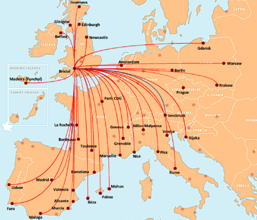
Which of these images do you prefer and why? –http://www.anna.aero/wp-content/uploads/2008/07/0711030_easyjet_04.gif –https://worldairlinenews.files.wordpress.com/2013/06/easyjet-uk-stn-62013-route-map.jpg
is the line something to do with geography?
What is the role of colour?
Does the colour have any meaning?
as well as / or instead of colour
About 3d
Bubbles as 3D spheres you are essentially no longer representing quantitative values through the size of a geometric area mark (Andy,handbook p167)”
Drawing the data or drawing a map?
it’s not necessarily important to be geographically accurate – but in some graphics it might be – should you actually draw lines from proper countries – if you do AND you use thickness of lines, are the lines going to get in each others way? how might you avoid this? might you make thicker lines more transparent? if you have multiple transparencies that intersect that creates a colour relationship
How could it have been interactive? Could the stamp turn into a pie chart when you mouse over
A static chart can only show the data in a period of time. It limited the way of presentation. An interactive chart can help realise the difference with a time line.
Why use bubble, not bar chart?
Add china map? Just with stroke?
About sketch:
The area of circle represents the amount of Chinese people traveling this country. Y-axle represents the increased ratio compared to the same quarter in last year. It will show like a thick line divided into white and black.When mouse over the circle, the line chart (central points connect) appear.
And important line will stretch with high lightness as background to facilitate understanding. The yellow color represents Chinese people. The red stroke represents Asia and the blue stroke represents the Europe.
There is a timeline from 2008 to 2016 which shows Top 10 countries as traveling destination, each chart shows one quarter data. Four green rectangular represent four seasons in each year.
Last but not the least, there are three buttons for top 3 countries, which will show all the numbers from 2008-2016 in one chart.
what year is this? how does this compare to other years? how does this compare to population?
